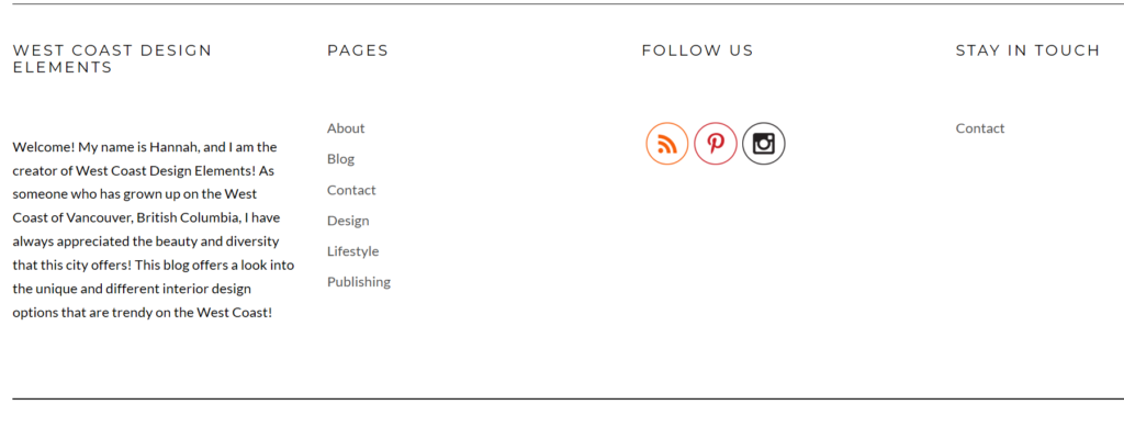
For Peer Review #2, I will be looking at Hannah Krutow’s website, “West Coast Design Elements.” After reading her first peer review, which was written by Tiffany Wong, she suggested that her blog would significantly benefit from incorporating a distinct logo, as well as consolidating the information presented on the “About” and the “About Me” pages.
Thus far, I do not see an originally designed logo. (though I am unsure if Hannah is considering doing so) Nonetheless, since then it appears that she made the change concerning the “About Me” page. Now, she solely has an “About” page summarizing her background and what the content on “West Coast Design Elements” entails. I commend Hannah for generating a well-written, but also very concise description. These adjustments notably have contributed to the site’s overall growth.
In terms of contacting, Hannah provides direct links to social media handles embedded in the corresponding logos, which evidently makes it simpler for viewers/the audience to find/reach her. These are not only located under “About,” they further show up on the top-right corner of the website, which I personally think is effective.


She has been posting consistently when observing both blog and PUB 201 posts. I read some of her professional entries – they are clearly appropriate and remain consistent with the blogsite’s topic throughout.
On the whole, the only existing challenge West Coast Design Elements faces is the layout for certain pages. To elaborate, while I believe the most recent posts appearing on the home page is completely fine, it is difficult to distinguish them each individually at first glance, because a) although the images are beautiful and high-quality, they are different sizes, and b) currently one entry is displayed in its entirety, whereas the rest only show the first 2-3 sentences.
I highly recommend Hannah follow the “F” pattern, which, according to The Daily Egg (2019), are the patterns that “follow the natural direction of human eyesight and attention.” It encompasses “users first read[ing] in a horizontal movement,” meaning tending to read “across the upper part of the content area,” subsequently “mov[ing] down the page” slightly, “read[ing] across in a second horizontal movement” usually “cover[ing] a shorter area than the previous movement” and lastly, “scan[ning] the content’s left side in a vertical movement” (Nielsen, 2006).
Generally speaking, Hannah exhibits an informed understanding of how to establish one’s online self and her content definitely showcases a keen interest in interior design. But, should she continue with this layout, I would be careful when considering the image-sizing and arrangement of her posts.
References
Nielsen, J. (2006, April 16). F-Shaped Pattern For Reading Web Content (original study). Retrieved from: https://www.nngroup.com/articles/f-shaped-pattern-reading-web-content-discovered/
The Daily Egg. (2019, February 15). The Best Website Layouts for User Experience and Conversions. Retrieved from: https://www.crazyegg.com/blog/best-website-layouts/
